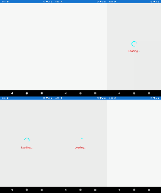
Creating custom Xamarin.Forms loading indicator with animations
It's inevitable that, as a mobile app developer, you will need to show a loading indicator in your app. These are mostly used to inform users that the application needs to do some "thinking" and the users are required to wait until the process is completed.

It's inevitable that, as a mobile app developer, you will need to show a loading indicator in your app. These are mostly used to inform users that the application needs to do some "thinking" and the users are required to wait until the process is completed. The most common scenarios when the loading indicator appears are when some data needs to be retrieved (e.g. via the HTTP(S) request).
Obviously, I'm not the first person who ran into this problem and tries to tackle it - there are already great solutions out there. One of which is Allan Ritchie's ACR User Dialogs plugin, which I highly recommend. Nevertheless, in my case, I needed to have full control over what the loading indicator control contains and how it behaves and animates. Therefore, I've created my own.
My custom loading indicator will have a spinner (aka ActivityIndicator) , optionally a text below the spinner, have ability to specify background color and will animated when toggling visibility.
XAML Code
Let's start from creating a ContentView, where all of the soon to be called LoadingIndicator control elements are going to live.
<?xml version="1.0" encoding="UTF-8"?>
<ContentView xmlns="http://xamarin.com/schemas/2014/forms"
             xmlns:x="http://schemas.microsoft.com/winfx/2009/xaml"
             xmlns:d="http://xamarin.com/schemas/2014/forms/design"
             xmlns:mc="http://schemas.openxmlformats.org/markup-compatibility/2006"
             mc:Ignorable="d"
             x:Class="Xamarin.Forms.Controls.LoadingIndicator"
             IsVisible="False"
             Opacity="0">
  <ContentView.Resources>
    <ResourceDictionary>
      <Style x:Key="LoadingIndicatorContainerStyle"
             TargetType="StackLayout">
        <Setter Property="HorizontalOptions"
                Value="Center" />
        <Setter Property="VerticalOptions"
                Value="Center" />
        <Setter Property="Spacing"
                Value="16" />
      </Style>

      <Style x:Key="LoadingIndicatorStyle"
             TargetType="ActivityIndicator">
        <Setter Property="HorizontalOptions"
                Value="Center" />
        <Setter Property="VerticalOptions"
                Value="Center" />
      </Style>

      <Style x:Key="LoadingIndicatorTextStyle"
             TargetType="Label">
        <Setter Property="IsVisible"
                Value="False" />
        <Setter Property="HorizontalTextAlignment"
                Value="Center" />
      </Style>
    </ResourceDictionary>
  </ContentView.Resources>
  <StackLayout Style="{StaticResource LoadingIndicatorContainerStyle}">
    <ActivityIndicator x:Name="LoadingIndicatorSpinner"
                       Style="{StaticResource LoadingIndicatorStyle}" />
    <Label x:Name="LoadingIndicatorText"
           Style="{StaticResource LoadingIndicatorTextStyle}" />
  </StackLayout>
</ContentView>
There's not much to explain in here. We have a StackLayout that contains the ActivityIndicator and a Label for the text below the spinner. Both of which have their own designated styles.
C# Code
using System.Threading;
using System.Threading.Tasks;
using Xamarin.Forms.Xaml;

namespace Xamarin.Forms.Controls
{
    [XamlCompilation(XamlCompilationOptions.Compile)]
    public partial class LoadingIndicator
    {
        public static readonly BindableProperty IsLoadingProperty = BindableProperty.Create(nameof(IsLoading), typeof(bool), typeof(LoadingIndicator), default(bool), propertyChanged: HandleIsRunningPropertyChanged);
        public static readonly BindableProperty LoadingIndicatorColorProperty = BindableProperty.Create(nameof(LoadingIndicatorColor), typeof(Color), typeof(LoadingIndicator), default(Color), propertyChanged: HandleSpinnerColorPropertyChanged);
        public static readonly BindableProperty TextColorProperty = BindableProperty.Create(nameof(TextColor), typeof(Color), typeof(LoadingIndicator), default(Color), propertyChanged: HandleTextFontColorPropertyChanged);
        public static readonly BindableProperty TextFontSizeProperty = BindableProperty.Create(nameof(TextFontSize), typeof(double), typeof(LoadingIndicator), default(double), propertyChanged: HandleTextFontSizePropertyChanged);
        public static readonly BindableProperty TextProperty = BindableProperty.Create(nameof(Text), typeof(string), typeof(LoadingIndicator), default(string), propertyChanged: HandleTextPropertyChanged);
        private const double FullyOpaque = 1;
        private const double FullyTransparent = 0;
        private const uint TogglingVisibilityAnimationDuration = 400;

        private static readonly SemaphoreSlim ToggleVisibilityAnimationSemaphoreSlim = new SemaphoreSlim(1);

        public LoadingIndicator()
        {
            InitializeComponent();
        }

        public bool IsLoading
        {
            get => (bool)GetValue(IsLoadingProperty);
            set => SetValue(IsLoadingProperty, value);
        }

        public Color LoadingIndicatorColor
        {
            get => (Color)GetValue(LoadingIndicatorColorProperty);
            set => SetValue(LoadingIndicatorColorProperty, value);
        }

        public string Text
        {
            get => (string)GetValue(TextProperty);
            set => SetValue(TextProperty, value);
        }

        public Color TextColor
        {
            get => (Color)GetValue(TextColorProperty);
            set => SetValue(TextColorProperty, value);
        }

        public double TextFontSize
        {
            get => (double)GetValue(TextFontSizeProperty);
            set => SetValue(TextFontSizeProperty, value);
        }

        private static async void HandleIsRunningPropertyChanged(BindableObject bindable, object oldValue, object newValue)
        {
            if (!(bindable is LoadingIndicator customActivityIndicator) || !(newValue is bool isRunning))
            {
                return;
            }

            await ToggleVisibility(customActivityIndicator);
        }

        private static void HandleSpinnerColorPropertyChanged(BindableObject bindable, object oldValue, object newValue)
        {
            if (!(bindable is LoadingIndicator customActivityIndicator) || !(newValue is Color spinnerColor))
            {
                return;
            }

            customActivityIndicator.LoadingIndicatorSpinner.Color = spinnerColor;
        }

        private static void HandleTextFontColorPropertyChanged(BindableObject bindable, object oldValue, object newValue)
        {
            if (!(bindable is LoadingIndicator customActivityIndicator) || !(newValue is Color textFontColor))
            {
                return;
            }

            customActivityIndicator.LoadingIndicatorText.TextColor = textFontColor;
        }

        private static void HandleTextFontSizePropertyChanged(BindableObject bindable, object oldValue, object newValue)
        {
            if (!(bindable is LoadingIndicator customActivityIndicator) || !(newValue is double textFontSize))
            {
                return;
            }

            customActivityIndicator.LoadingIndicatorText.FontSize = textFontSize;
        }

        private static void HandleTextPropertyChanged(BindableObject bindable, object oldValue, object newValue)
        {
            if (!(bindable is LoadingIndicator customActivityIndicator) || !(newValue is string text) || string.IsNullOrWhiteSpace(text))
            {
                return;
            }

            customActivityIndicator.LoadingIndicatorText.Text = text;
            customActivityIndicator.LoadingIndicatorText.IsVisible = true;
        }

        private static async Task ToggleVisibility(LoadingIndicator customActivityIndicator)
        {
            try
            {
                ViewExtensions.CancelAnimations(customActivityIndicator);

                await ToggleVisibilityAnimationSemaphoreSlim.WaitAsync();
                if (customActivityIndicator.IsLoading)
                {
                    customActivityIndicator.LoadingIndicatorSpinner.IsRunning = true;
                    customActivityIndicator.IsVisible = true;
                    await customActivityIndicator.FadeTo(FullyOpaque, TogglingVisibilityAnimationDuration);
                }
                else
                {
                    await customActivityIndicator.FadeTo(FullyTransparent, TogglingVisibilityAnimationDuration);
                    customActivityIndicator.LoadingIndicatorSpinner.IsRunning = false;
                    customActivityIndicator.IsVisible = false;
                }
            }
            finally
            {
                ToggleVisibilityAnimationSemaphoreSlim.Release();
            }
        }
    }
}
Few things to note from the above code:
- We're exposing control's functionality (i.e. properties
IsLoading,Textetc.) to the users of this control. - We have property change handlers to update the UI
- We run animations when the
IsLoadingproperty changes
I think most of the above code should be self explanatory. I will only get a bit deeper into how we're dealing with executing animations.
Animations
The most important thing is to make sure that we don't run multiple animations at the same time, therefore we use the ToggleVisibilityAnimationSemaphorSlim (read more about SemaphorSlim's in the docs), which will ensure in an async manner that we will only run 1 animation at a time. Making this logic async aware is very important as we don't want our UI thread to get stuck and freez.
Another important element of our animation execution logic is that we will cancel currently running animation using ViewExtensions.CancelAnimations - if there are no animations currently running then this method won't do anything. The above should take care of the situation when the task that is running while the loading indicator is being shown, completes before the animation finishes (i.e. fading the loading indicator takes longer then the task that the loading indicator is show for). This is highly unlikely to happen if your animations are very quick (i.e. < 400ms) but you can imagine that if we extend the animation duration (e.g. > 1 sec) it would be possible for some HTTP(S) calls to finish before that time elapses.
Sample
You can find source code and samples for this control in the Progrunning.Xamarin github repo, inside the Xamarin.Forms.Controls folder. The below code shows how to use it:
<?xml version="1.0" encoding="utf-8" ?>
<ContentPage xmlns="http://xamarin.com/schemas/2014/forms"
             xmlns:x="http://schemas.microsoft.com/winfx/2009/xaml"
             xmlns:d="http://xamarin.com/schemas/2014/forms/design"
             xmlns:mc="http://schemas.openxmlformats.org/markup-compatibility/2006"
             xmlns:controls="clr-namespace:Xamarin.Forms.Controls;assembly=Xamarin.Forms.Controls"
             mc:Ignorable="d"
             x:Class="Playground.UI.Views.MainPage">

    <controls:LoadingIndicator BackgroundColor="#0C000000"
                               IsLoading="{Binding IsLoadingData, Mode=OneWay}"
                               LoadingIndicatorColor="Aqua"
                               Text="Loading..."
                               TextColor="Red"
                               TextFontSize="20" />
</ContentPage>


